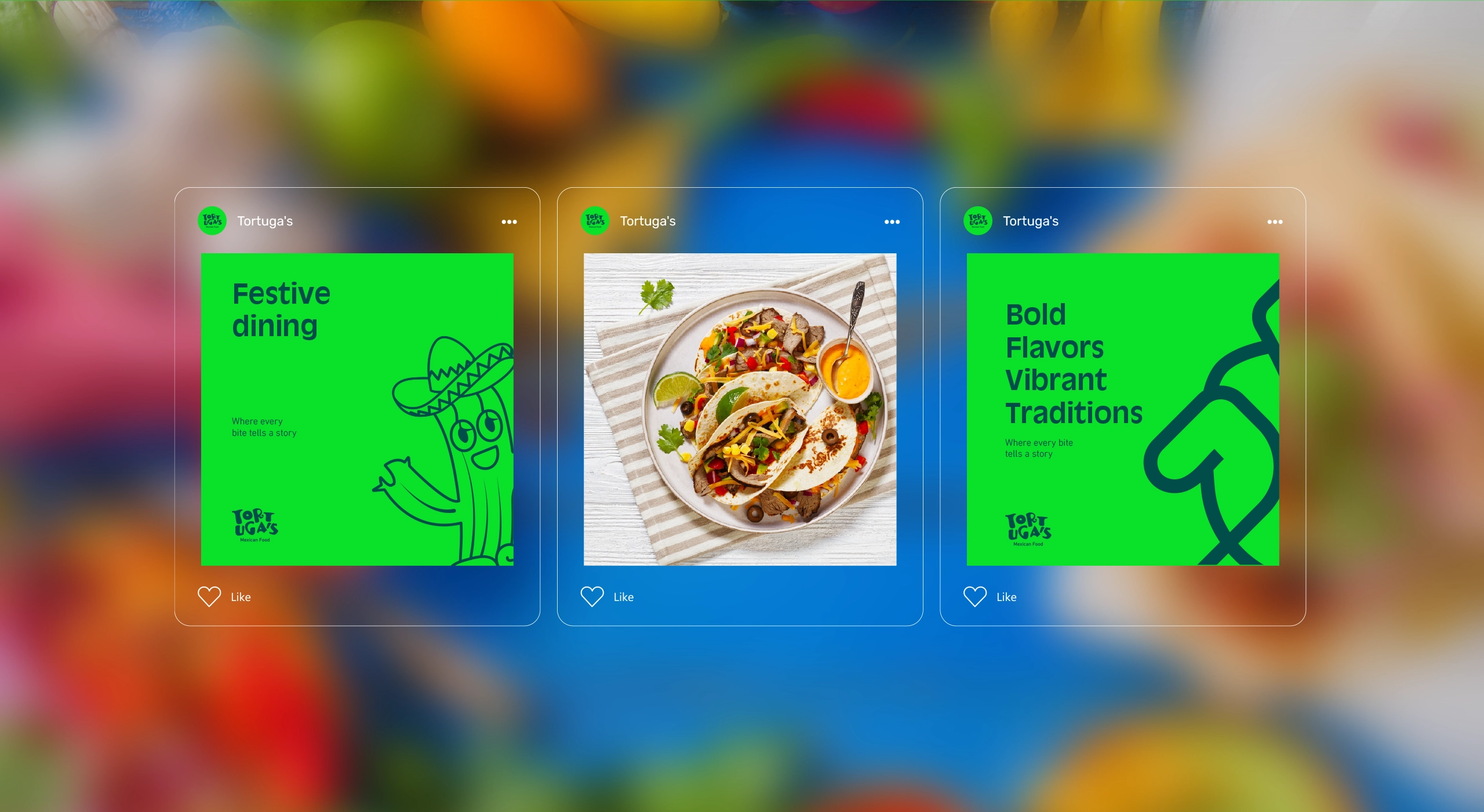
Tortuga’s
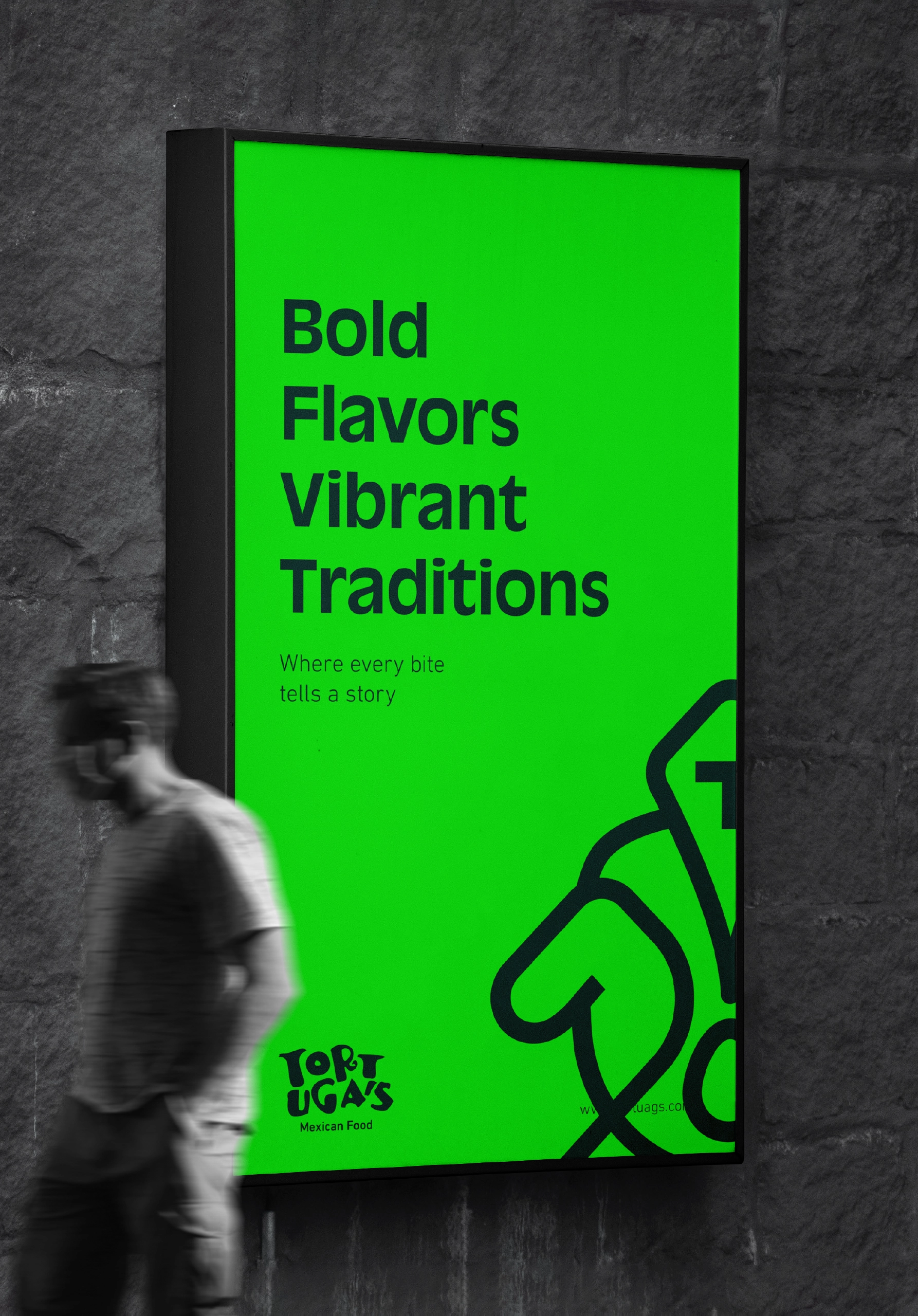
Bold Flavors, Vibrant Traditions.
Bringing the spirit of Mexico to Saudi Arabia.
CLIENT
Tortuga’s
SECTOR
Mexican Street Food & Casual Dining
YEAR
2023
SERVICES
- Brand Naming
- Brand Strategy
- Logo & Visual Identity
- Brand Guidelines
THE CHALLENGE
Introducing an energetic Mexican street-food concept to a market where authentic Mexican experiences remained limited while creating a brand that felt culturally inspired, contemporary, and approachable to local audiences.
THE SOLUTION
We built Tortuga’s around the energy of Mexican streets: bold flavors, vibrant traditions, expressive colors, and a strong sense of celebration. Beginning with the name and strategic direction, we translated this spirit into a distinctive verbal and visual identity.
THE IMPACT
A recognizable and flexible brand system that gives Tortuga’s a strong presence across the restaurant, packaging, menus, signage, and digital communication, turning every interaction into part of one lively Mexican experience.
THE BEGINNING
A Market Hungry for Something New
Tortuga’s began with an opportunity to introduce a different kind of dining experience to Saudi Arabia, one inspired by the flavors, movement, and character of Mexican street food.
The concept was never intended to be another conventional casual restaurant. It needed to create an atmosphere people could experience through the food, surroundings, packaging, and communication.
The opportunity was to transform an underrepresented cuisine into an accessible and memorable brand, one that celebrates Mexican culture as much as it celebrates flavor.
Tortuga’s needed to feel authentic without becoming traditional, expressive without becoming chaotic, and new without feeling unfamiliar to the Saudi audience.
At the heart of Tortuga’s is a celebration of two inseparable parts of Mexican street food: the intensity of its flavors and the richness of the traditions behind them.
More than a place to eat.
A new street-food experience to discover.
THE NAME
A Name with Character
We developed the name Tortuga’s to give the restaurant a memorable and characterful identity from its first introduction.
Derived from the Spanish word for “turtle,” the name establishes an immediate connection with the language and culture behind the concept without relying on a literal food description.
Distinctive, playful, and easy to recognize, Tortuga’s gave the brand room to create its own world—one filled with flavor, color, movement, and personality.
A name that sounds like a place.
And feels like a character.
THE STRATEGY
From the Streets to the Spotlight
The brand strategy was built around four connected principles:
FLAVOR
Putting bold, distinctive food at the center of the experience.
ENERGY
Capturing the movement, spontaneity, and social atmosphere of Mexican streets.
TRADITION
Drawing from Mexican culture with respect while presenting it through a contemporary perspective.
ACCESSIBILITY
Creating an experience that feels welcoming, enjoyable, and easy for local customers to explore.
Together, these principles shaped a personality that is bold, lively, expressive, and friendly.
They also helped position Tortuga’s as a contemporary Mexican street-food brand that respects its cultural inspiration while creating an experience relevant to the Saudi market.
The spirit of Mexican streets—brought into a fresh, contemporary dining experience.
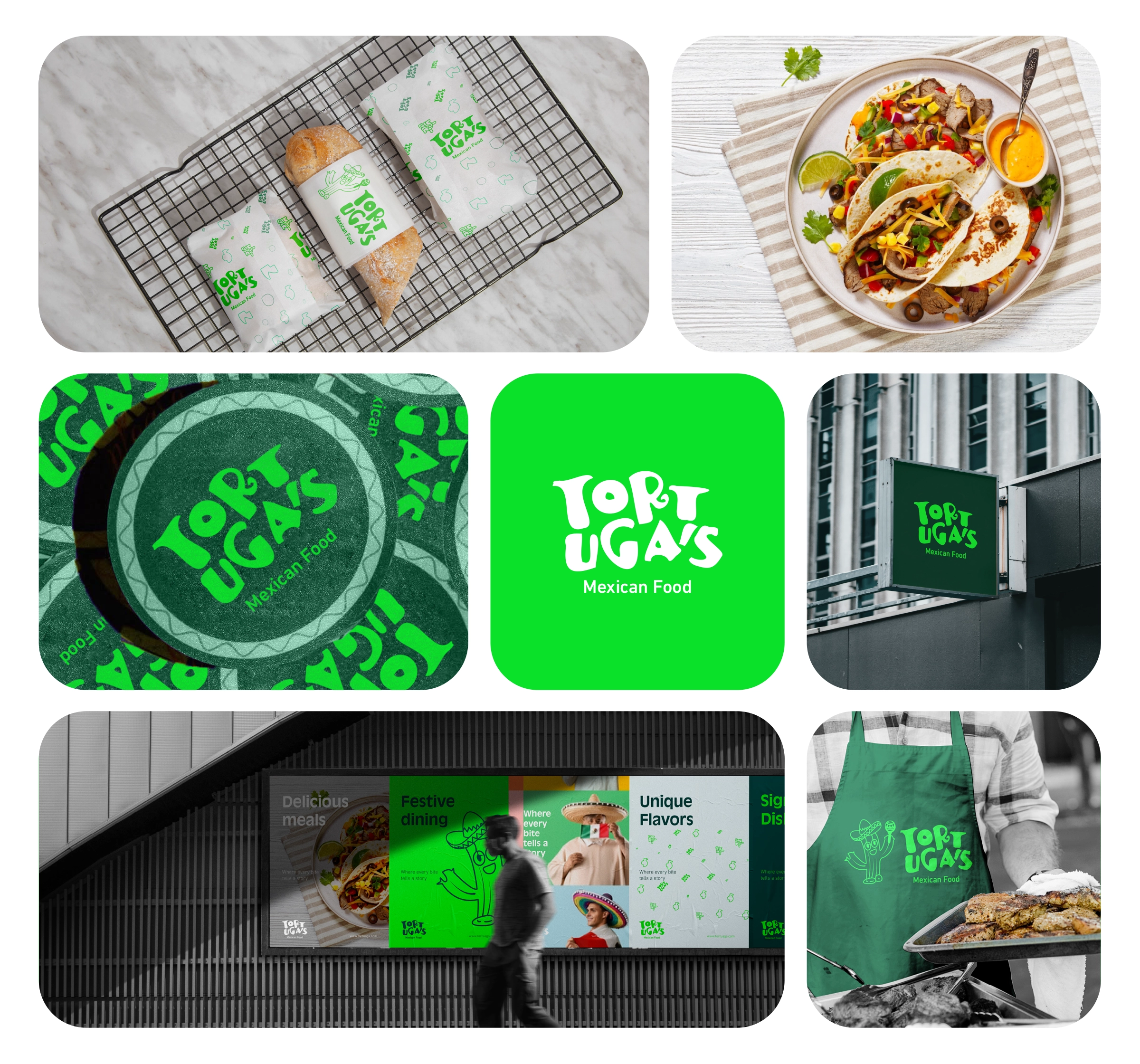
THE VISUAL IDENTITY
Design with Flavor
The visual identity was designed to carry the same energy customers experience in the food.
Bold color combinations, expressive typography, playful illustrations, and flexible graphic elements come together to create a system that feels lively and unmistakably Tortuga’s.
Rather than reproducing familiar Mexican visual clichés, the identity takes inspiration from the culture’s colors, street graphics, symbols, and celebratory spirit—then translates them into a contemporary restaurant brand.
A visual identity with as much character as the food it represents.
THE LOGO
A Mark Full of Personality
The Tortuga’s logo was designed to feel bold, playful, and easy to recognize.
Its distinctive form gives the brand a confident signature that stands out across restaurant signage, menus, packaging, uniforms, and digital platforms.
The logo works as both a practical identifier and an introduction to the brand’s personality, informal enough for street food, yet structured enough to support a consistent and professional restaurant experience.
Simple at first glance.
Full of character at every encounter.
COLOR & TYPOGRAPHY
A Palette Made to Be Seen
The color palette reflects the vivid and expressive character of Mexican street culture.
Bright green introduces freshness and energy, while deep blue gives the identity confidence and visual distinction. Black and white provide contrast, allowing the brighter elements to remain clear and controlled across different applications.
Typography adds another layer of personality. Bold headline styles create immediate impact, while supporting typefaces keep menus, product information, and digital communication clear and easy to navigate.
Bright in color.
Bold in character.
Clear in communication.
THE GRAPHIC LANGUAGE
A World Built from Flavor and Culture
A flexible graphic language was created to give Tortuga’s a richer and more ownable visual world.
Illustrations and symbols inspired by ingredients, Mexican culture, street signs, and everyday dining moments add rhythm and personality to the identity.
These elements can appear individually or combine into energetic patterns, allowing the brand to create variety across packaging and communication without losing recognition or consistency.
Every symbol adds another piece to the Tortuga’s story.
The Tortuga’s identity was designed to live beyond the logo and become part of the complete dining experience.
From the restaurant signage and interior graphics to menus, food packaging, trays, uniforms, and takeaway materials, every application carries the same visual energy.
This consistency helps customers enter the Tortuga’s world from the moment they see the restaurant, and keeps the brand recognizable long after the meal is over.
The experience begins before the first bite.
BRAND GUIDELINES
Keeping the Energy Consistent
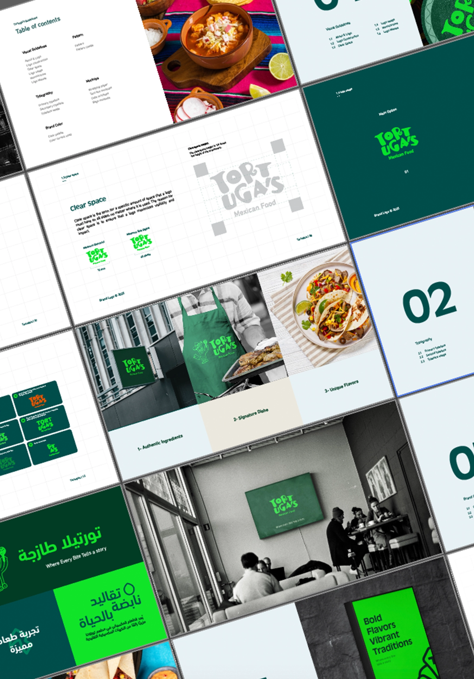
We developed comprehensive brand guidelines to help Tortuga’s maintain a consistent identity across every customer touchpoint.
The guidelines define how the logo, colors, typography, illustrations, patterns, imagery, layouts, and verbal style should be used.
This gives the team and its creative partners a practical system for developing future branches, campaigns, menus, packaging, and digital content—without losing the personality that makes Tortuga’s distinctive.
A vibrant identity still needs clear rules.
THE OUTCOME
A New Taste in Town
Tortuga’s emerged as a distinctive Mexican street-food brand built around bold flavor, vibrant culture, and an energetic dining experience.
From the name and strategic direction to the visual language and restaurant applications, every element works together to introduce a clear and memorable world.
The brand now has a flexible foundation that can support new menu items, campaigns, collaborations, and future locations while maintaining the character that defined it from the beginning.
A visual and verbal identity that doesn’t just look Mexican.
It feels alive.