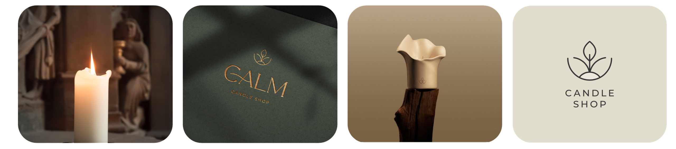
Calm
Light the Stillness
Creating moments that breathe, not burn.
CLIENT
Calm
SECTOR
Home Fragrance & E-Commerce
YEAR
2024
SERVICES
- Brand Naming
- Brand Strategy
- Logo & Visual Identity
- Brand Guidelines
THE CHALLENGE
Creating a distinctive candle brand in a category filled with similar products, visual styles, and promises of relaxation, while building an identity that could communicate emotion, quality, and calm through an entirely digital shopping experience.
THE SOLUTION
We positioned Calm around the idea of intentional stillness: small sensory rituals that help people slow down and reconnect with their spaces. Beginning with the name, we translated this direction into a restrained, warm, and timeless visual identity.
THE IMPACT
A clear and cohesive brand system that gives Calm a distinctive presence, supports its digital launch, and creates a flexible foundation for future scents, collections, and home-fragrance products.
THE BEGINNING
Creating Space for Stillness
Calm began with a simple observation: everyday life rarely gives people permission to pause.
Between constant movement, digital noise, and crowded routines, quiet moments have become increasingly valuable. A candle can create one of those moments, not only through its scent, but through the atmosphere and feeling it brings into a space.
The opportunity was to build a brand that could make stillness feel intentional, accessible, and part of everyday life.
The home-fragrance market is filled with brands that communicate through similar neutral palettes, familiar lifestyle imagery, and broad promises of comfort and relaxation.
Calm needed to feel peaceful without becoming invisible, and refined without appearing distant or overly luxurious.
The challenge was to create a distinctive brand presence using restraint rather than excess, giving the brand enough character to be remembered while preserving the quiet feeling at its heart.
Sometimes, changing the atmosphere is enough to change the moment.
THE NAME
One Word That Says Enough
We developed the name Calm to express the emotional result the brand seeks to create.
Direct, familiar, and easy to remember, the name moves beyond describing the product. It captures the state people hope to experience when lighting a candle: a quieter mind, a warmer space, and a moment that feels entirely their own.
Its simplicity also gives the brand room to grow naturally into new scents, collections, rituals, and home-fragrance products.
Calm is more than a name.
It is the feeling the brand promises to leave behind.
THE STRATEGY
The Meaning Behind the Position
The brand strategy was built around four connected principles:
STILLNESS
Creating a sense of pause within busy, everyday routines.
WARMTH
Making spaces feel more personal, comforting, and emotionally inviting.
INTENTION
Encouraging people to treat simple moments as meaningful rituals.
SIMPLICITY
Communicating clearly and avoiding unnecessary visual or verbal noise.
Together, these principles shaped a brand personality that is composed, thoughtful, warm, and quietly confident.
They also established a clear direction for how Calm should look, speak, and make people feel at every touchpoint.
A brand designed not only to scent a room, but to shift its rhythm.
THE VISUAL IDENTITY
The Aesthetics of Stillness
Calm’s visual identity was created to feel balanced, understated, and emotionally warm.
The Calm logo was designed to express the simplicity and emotional clarity behind the brand.
Its clean construction and balanced proportions create a distinctive signature without unnecessary complexity. The mark feels contemporary while remaining warm and timeless enough to live naturally within the home.
The system was also designed to remain recognizable across candle labels, packaging, digital platforms, social media, and smaller applications.
The system uses generous space, restrained compositions, soft natural tones, and carefully considered typography. Rather than competing for attention, these elements work together to create a quieter and more deliberate visual experience.
The result reflects the feeling of the product itself: gentle in expression, clear in purpose, and present without becoming overwhelming.
Every element was designed to feel like a slow exhale—deliberate, comforting, and lasting.
COLOR & TYPOGRAPHY
A Palette That Leaves Room to Breathe
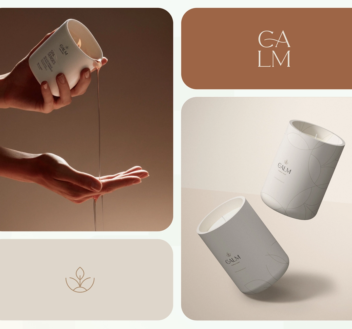
The color palette draws from warm interiors, natural materials, and the soft atmosphere created by candlelight.
Cream and muted neutral tones establish a calm foundation, while deeper colors provide contrast and give individual scents or collections their own character.
Typography brings structure and clarity to the system. Its restrained use creates a visual rhythm that feels editorial, refined, and easy to navigate across both packaging and digital communications.
Soft in tone.
Clear in expression.
Warm in feeling.
PACKAGING
Designed to Become Part of the Space
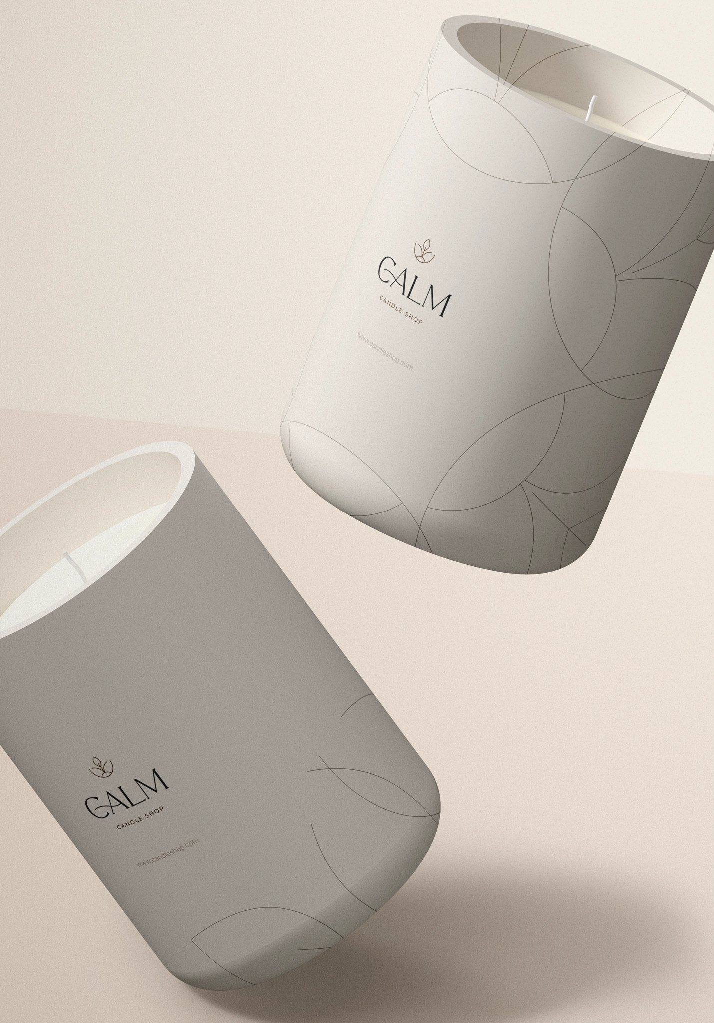
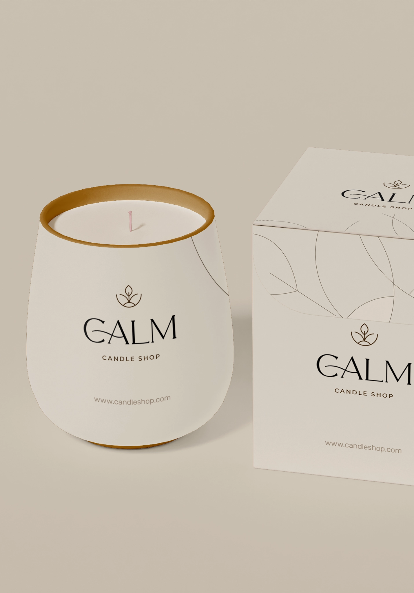
A home candle is not hidden after purchase. It becomes an object within the room and part of its visual atmosphere.
The packaging system was therefore designed to feel considered from the first interaction while allowing the candle itself to sit naturally within different interiors.
A consistent label structure builds recognition across the collection, while flexible colors and product information help distinguish scents without fragmenting the identity.
Made to be noticed gently, and remembered long after the flame is gone.
THE DIGITAL EXPERIENCE
Lighting the Brand’s Path
As an e-commerce brand, Calm needed to communicate an experience customers could not physically smell or touch before purchasing.
The identity was designed to support this challenge through atmospheric photography, clear product presentation, thoughtful language, and a consistent visual rhythm across the online store and social media.
Every digital interaction helps customers imagine how each candle could feel within their own space, not simply how it looks as a product.
When scent cannot travel through the screen, the brand must carry the feeling.
BRAND GUIDELINES
Protecting the Feeling as the Brand Grows
We developed comprehensive brand guidelines to help Calm maintain a consistent identity across every future touchpoint.
The guidelines define the correct use of the logo, colors, typography, imagery, layouts, packaging, and verbal style.
This gives the team a practical reference for developing new scents, collections, campaigns, and communications, while preserving the balance and restraint that make Calm recognizable.
Consistency turns a beautiful identity into a recognizable brand.
THE OUTCOME
Expanding the Experience
Calm emerged as a thoughtful and cohesive home-candle brand built around the emotional value of stillness.
From the name and strategic position to the visual identity and packaging system, every element contributes to one clear and consistent feeling.
The brand now has a flexible foundation that can support new scents, seasonal collections, gifting experiences, and future home-fragrance products without losing the quiet idea at its core.
A flame for the room.
A moment for yourself.