
Olympic Village
Where Young Dreams Begin
Building champions, one dream at a time.
Refining the identity of a multi-sport training center created to help young athletes discover their abilities, develop their skills, and grow through sport.
CLIENT
Olympic Village
SECTOR
Youth Sports & Training
AUDIENCE
Young Athletes Aged 16 and Under
Parents & Families
YEAR
2023
SERVICES
- Logo Redrawing & Refinement
- Visual Identity
- Brand Guidelines
THE CHALLENGE
Creating one cohesive identity for a sports center offering football, basketball, volleyball, swimming, karate, and other activities, while appealing to young athletes and reassuring the parents responsible for choosing their training environment.
THE SOLUTION
We carefully redrew and refined the existing logo, then developed a dynamic visual system built around movement, energy, variety, and youthful ambition. The identity gives every sport room to stand apart while keeping the entire Olympic Village experience connected.
THE IMPACT
A clearer, more consistent, and more energetic brand presence that can represent different sports, engage young athletes, earn parents’ confidence, and grow alongside the center’s programs.
THE BEGINNING
Every Athlete Starts Somewhere
Before the medals, records, and unforgettable victories, every athlete begins with a first attempt.
A first kick. A first lap. A first serve. A first disciplined movement.
Olympic Village was created to give young people a place where these beginnings can become meaningful experiences.
Through football, basketball, volleyball, swimming, karate, and other sports, the center helps young athletes discover what they enjoy, build their abilities, and develop habits that extend beyond training.
It is a place for learning, movement, confidence, discipline, friendship, and personal growth.
The identity needed to capture the excitement of beginning a sporting journey and the possibility contained within every young athlete.
Olympic Village is not associated with one sport, one type of movement, or one kind of athlete.
Its programs bring together team sports, individual disciplines, indoor activities, outdoor training, strength, speed, coordination, and endurance.
This variety created a clear visual challenge.
The identity needed to represent football without appearing to be a football academy. It needed to include swimming, karate, basketball, volleyball, and future programs without becoming visually crowded or fragmented.
It also needed to communicate with two connected audiences.
For young athletes, the brand had to feel active, exciting, and inspiring. For parents, it had to reflect safety, structure, professionalism, and purposeful development.
Every champion was once a beginner.
Every dream begins with a first move.
THE DESIGN OBJECTIVE
Safe. Inspiring. Athletic.
The visual direction was guided by three qualities that define the experience Olympic Village seeks to create.
SAFE: A reassuring environment where parents feel confident and young athletes receive age-appropriate training and support.
INSPIRING: A place that encourages children and teenagers to explore their abilities, improve continuously, and imagine what they could become.
ATHLETIC: An energetic and disciplined experience shaped by movement, practice, teamwork, and healthy competition.
These qualities gave the identity a balanced character.
It needed to feel youthful without appearing childish, professional without becoming institutional, and energetic without creating unnecessary visual noise.
Exciting for young athletes.
Reassuring for their families.
THE VISUAL IDEA
Energy in Motion
Movement became the central visual idea behind the identity.
Every sport has its own rhythm.
A swimmer moves through water differently from a football player crossing the field. A karate athlete expresses control and precision, while basketball and volleyball depend on speed, elevation, and coordinated teamwork.
The visual system translates this variety into energetic compositions, changing directions, active forms, and flexible layouts.
Rather than representing one specific sport, the identity captures the shared quality connecting them all: purposeful movement.
This allows Olympic Village to communicate different programs while maintaining one recognizable character.
Different movements.
One shared energy.
THE COLOR SYSTEM & TYPOGRAPHY
A Color for Every Kind of Energy
A broad and vibrant color palette gives the identity the flexibility required by a multi-sport center.
The core colors establish Olympic Village’s overall presence, while supporting combinations introduce variety across sports, programs, events, age groups, and communication materials.
Bold colors capture the excitement young athletes associate with movement and play. Brighter and lighter tones keep the identity approachable, while controlled contrast ensures information remains clear and functional.
The palette can shift in emphasis without making each activity feel like a separate brand.
Whether the application belongs to football, swimming, karate, or a seasonal program, it remains unmistakably part of Olympic Village.
Typography plays an important role in giving the identity its youthful and athletic voice.
Bold headlines create energy, confidence, and immediate visibility, while clear supporting typefaces make schedules, instructions, program details, and safety information easy to understand.
The typographic hierarchy was developed to work in both Arabic and English across a wide range of applications.
Many colors.
Many possibilities.
One Olympic Village.
THE GRAPHIC SYSTEM
A Brand in Motion
The graphic system extends the energy of the logo into a flexible family of shapes, patterns, frames, and compositions.
Curved forms suggest changing direction and continuous movement. Overlapping elements communicate teamwork and connection, while dynamic cropping gives photography a stronger sense of action.
The system can expand, rotate, and adapt according to the content and format.
It creates expressive layouts for campaigns and social media while remaining organized enough for schedules, certificates, presentations, signs, and registration materials.
This balance allows the identity to remain active without losing clarity.
Built to move.
Designed to stay connected.
PHOTOGRAPHY
The Spirit of Participation
The photography direction focuses on young athletes in motion, not only on winning.
It captures concentration during practice, encouragement from coaches, teamwork between players, the courage to try again, and the satisfaction of personal improvement.
Dynamic angles, authentic expressions, and close views of sporting details help the audience feel the energy of the experience.
The imagery also reflects the diversity of Olympic Village.
Different ages, abilities, sports, and personalities are represented so that more young people can see a place for themselves within the brand.
Sport is not only about finishing first.
It is about becoming better than before.

THE MULTI-SPORT SYSTEM
One Village. Many Sporting Journeys.
A flexible identification system was developed to help Olympic Village organize and communicate its different sports.
Each activity can use relevant imagery, color combinations, graphic movement, and supporting information while remaining within the shared identity.
This makes it easier for athletes and parents to recognize programs, navigate schedules, understand announcements, and engage with the sports that interest them.
It also gives Olympic Village the flexibility to introduce new activities, competitions, camps, and seasonal programs without creating a separate visual identity each time.
The system supports variety while protecting unity.
Every sport has its own character.
Every program belongs to the same village.
THE BRAND EXPERIENCE
A Brand That Inspires Movement
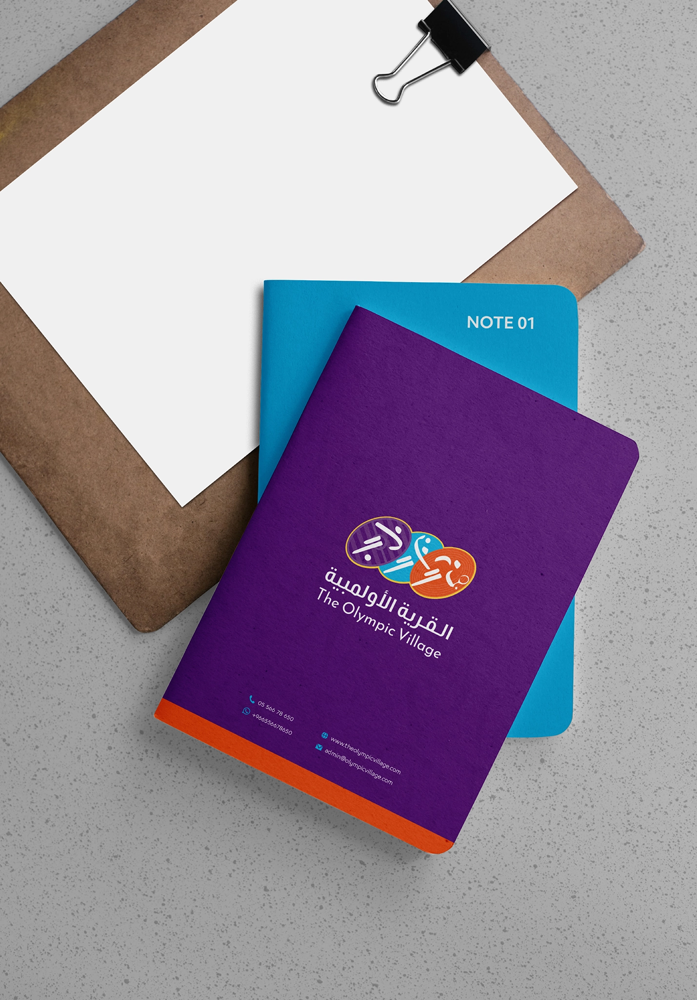
The identity was designed to become part of the complete Olympic Village experience.
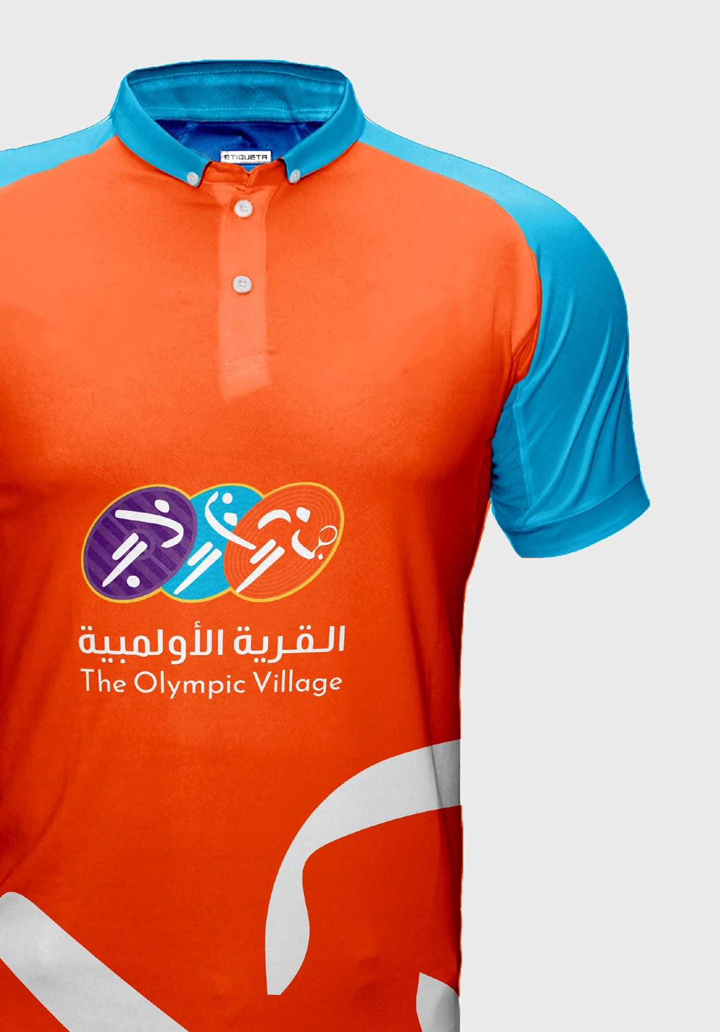
On uniforms, it helps young athletes feel that they belong to a team.
Across courts, pools, training spaces, and signage, it creates a more organized and recognizable environment.
On certificates, medals, and achievement cards, it gives every stage of progress a sense of meaning.
Across social media, advertising, schedules, registration materials, and parent communication, it presents the center with greater energy and consistency.
Every touchpoint contributes to an experience that motivates young athletes and strengthens parents’ confidence in the center.
An identity young athletes can wear with pride.
An experience parents can trust.
BRAND GUIDELINES
Keeping Every Sport Connected
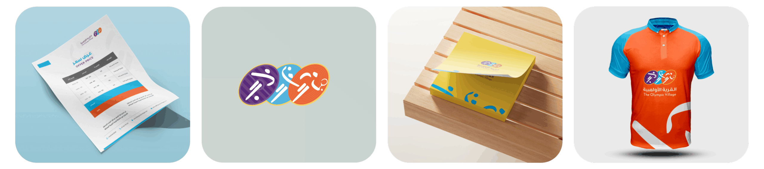
We developed comprehensive brand guidelines to ensure that Olympic Village maintains a clear and consistent identity across all its programs and touchpoints.
The guidelines define the correct use of the refined logo, colors, typography, imagery, graphic elements, layouts, and key applications.
They provide the center’s team, coaches, suppliers, and creative partners with a practical reference for producing uniforms, signage, campaigns, certificates, schedules, event materials, and digital content.
The guidelines also explain how the system can adapt to different sports without losing the recognizable visual character of Olympic Village.
Flexible across every sport.
Consistent across every experience.
THE OUTCOME
Raising the Next Generation of Athletes
Olympic Village emerged with a more refined and cohesive identity capable of representing the full scale of its sporting experience.
Redrawing the logo improved its clarity and performance while preserving its familiar character. The wider visual system transformed it into an energetic brand that can communicate multiple sports, programs, and achievements through one connected language.
The identity now speaks to both sides of the center’s audience.
It gives young athletes an exciting world they can participate in and gives parents a more organized, professional, and reassuring experience.
Most importantly, it provides Olympic Village with a flexible platform for welcoming more athletes, adding new sports, and supporting young people as they take their next step forward.
A place to begin.
A place to belong.
A place to become.
Let’s Build Brands That Move People
The strongest sports brands do more than identify a place.
They inspire participation, create belonging, and give every athlete a reason to keep moving forward.
At Tnween, we develop visual identities that bring different experiences together and give ambitious organizations a clear, recognizable foundation for growth.
